Revamp Transfer Mini App
Digital Banking App
Digital Banking App
April - June 2022
Responsibilities
• Research: User Insights, Competitor Analysis, Competitive Matrix, MoSCoW
• UX Design: Information Architecture, Wireframing, Prototyping, Support Usability Testing Summary
• UI Design + Iterations
• Handoff Project to Developers
• Research: User Insights, Competitor Analysis, Competitive Matrix, MoSCoW
• UX Design: Information Architecture, Wireframing, Prototyping, Support Usability Testing Summary
• UI Design + Iterations
• Handoff Project to Developers
Timeline
• April - June 2022 (10 weeks)
• Worked on as a side project besides the main one
• April - June 2022 (10 weeks)
• Worked on as a side project besides the main one
Project Introduction →
This data was collected from July 2021 to April 2022, according to CSAT data provided by the CX team. Our research team discovered that transfer transactions received the most complaints, followed by payment transactions.
When we looked deeper, we noticed that a lot of the issues were about transfer steps, favorites, and transaction history, all of which were key aspects that needed to be improved immediately.
When we looked deeper, we noticed that a lot of the issues were about transfer steps, favorites, and transaction history, all of which were key aspects that needed to be improved immediately.
CSAT - Transfer Issue Details
1. Favorite (174)
• Edit / Delete Favorites (126)
• Add new favorites (48)
2. History (58)
• See history details
3. UX (49)
• Transfer step : copy account number ,lack of destination account details
4. Slip (34)
• Cannot share slip
5. Error (25)
• Did not receive transfer slip / Error transfer
1. Favorite (174)
• Edit / Delete Favorites (126)
• Add new favorites (48)
2. History (58)
• See history details
3. UX (49)
• Transfer step : copy account number ,lack of destination account details
4. Slip (34)
• Cannot share slip
5. Error (25)
• Did not receive transfer slip / Error transfer
Competitor Analysis →
In order to conduct a comprehensive competitor analysis, it is important to thoroughly research and evaluate the leading competitors in the market. This involves examining key features such as Transfer Transactions, Favorites, Scan to Pay, and more, and analyzing the pros and cons of each competitor.
During the research process, it is crucial to explore their offerings, user interfaces, and functionalities related to transaction features, which typically involve the ability to send and receive funds conveniently and securely.
During the research process, it is crucial to explore their offerings, user interfaces, and functionalities related to transaction features, which typically involve the ability to send and receive funds conveniently and securely.

MoSCoW Analysis
After collecting all user feedback and analyzing competitors, our team used the MoSCoW framework to evaluate and prioritize what needs to be improved in order to deliver the best experience for users
After collecting all user feedback and analyzing competitors, our team used the MoSCoW framework to evaluate and prioritize what needs to be improved in order to deliver the best experience for users

Identify Problems →
Existing Transfer Flow
• Confusing user journey due to pages going back and forth
• Too many steps
• Confusing information hierarchy
• Inconsistency design
• Hard to find Transaction History
• Excessive space and text size
• Unstable app system and delayed display information
• Confusing user journey due to pages going back and forth
• Too many steps
• Confusing information hierarchy
• Inconsistency design
• Hard to find Transaction History
• Excessive space and text size
• Unstable app system and delayed display information
Revamp Design Goals

Ease of Use
For a better user experience, we need to revise and simplify the transfer process. Make it as simple as possible for users by reducing unnecessary data and delivering it in consistent ways.

Discoverable
Transfer Transactions contain multiple features, so we must ensure that all of these features are easily discoverable and accessible by users.
Increase Efficiency
Through the learning curve for users, one small improvement can affect many users by displaying more cues on-screen and using consistent design can create more efficiency.
Features Improvement


Usability Testing Summary →
Participants Overview
Our usability testing participants were divided into three age groups: 20-29, 30-39, and 40-59. There are various career groups, such as business owners, corporate employees, freelancers, lawyers, and designers.
The majority of participants use digital banking in their daily lives, such as transfers, adding favorites, scheduling transactions, and viewing transaction history via the CIMB THAI app and other bank apps.

Remote Usability Testing
Our usability testing included 3 tasks with specific goals. These tasks were selected to test their efficiency and user friendliness.
Participants were given simulated real-world scenarios and had to complete each task. Our rigorous usability testing enables us to gather user insights and feedback to ensure our solution meets their needs and expectations.
3 Tasks / Duration: 45 Mins

Key Findings
1. Overall, users can complete the first use because it is concise, easy to understand, and the transfer process is not significantly different from other banks
2. Users take their time finding the menu in specific cases, such as adding a new favorite, scheduling a transfer, or looking up transaction history
3. Account mini-apps and transfer mini-apps are misunderstood by users.

Final Solution & Design →
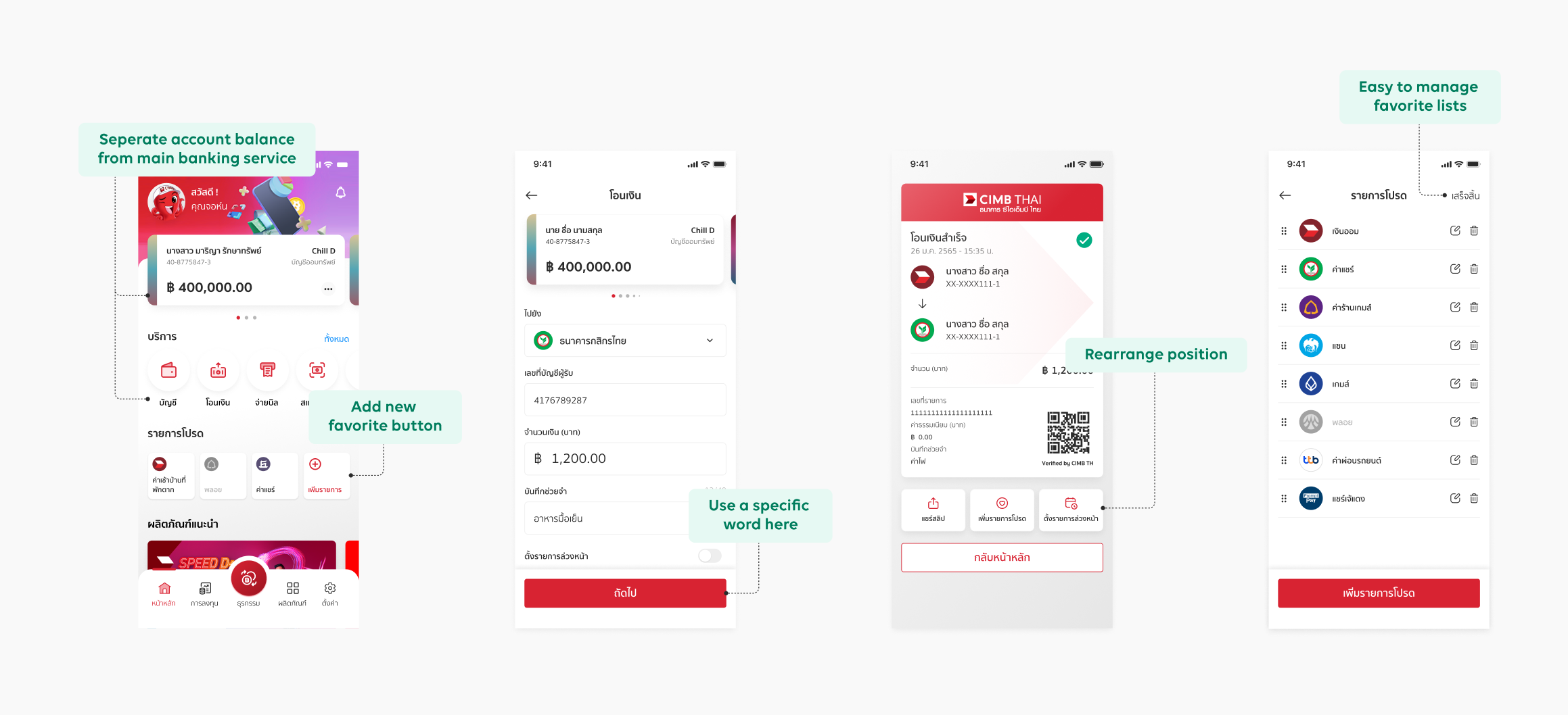
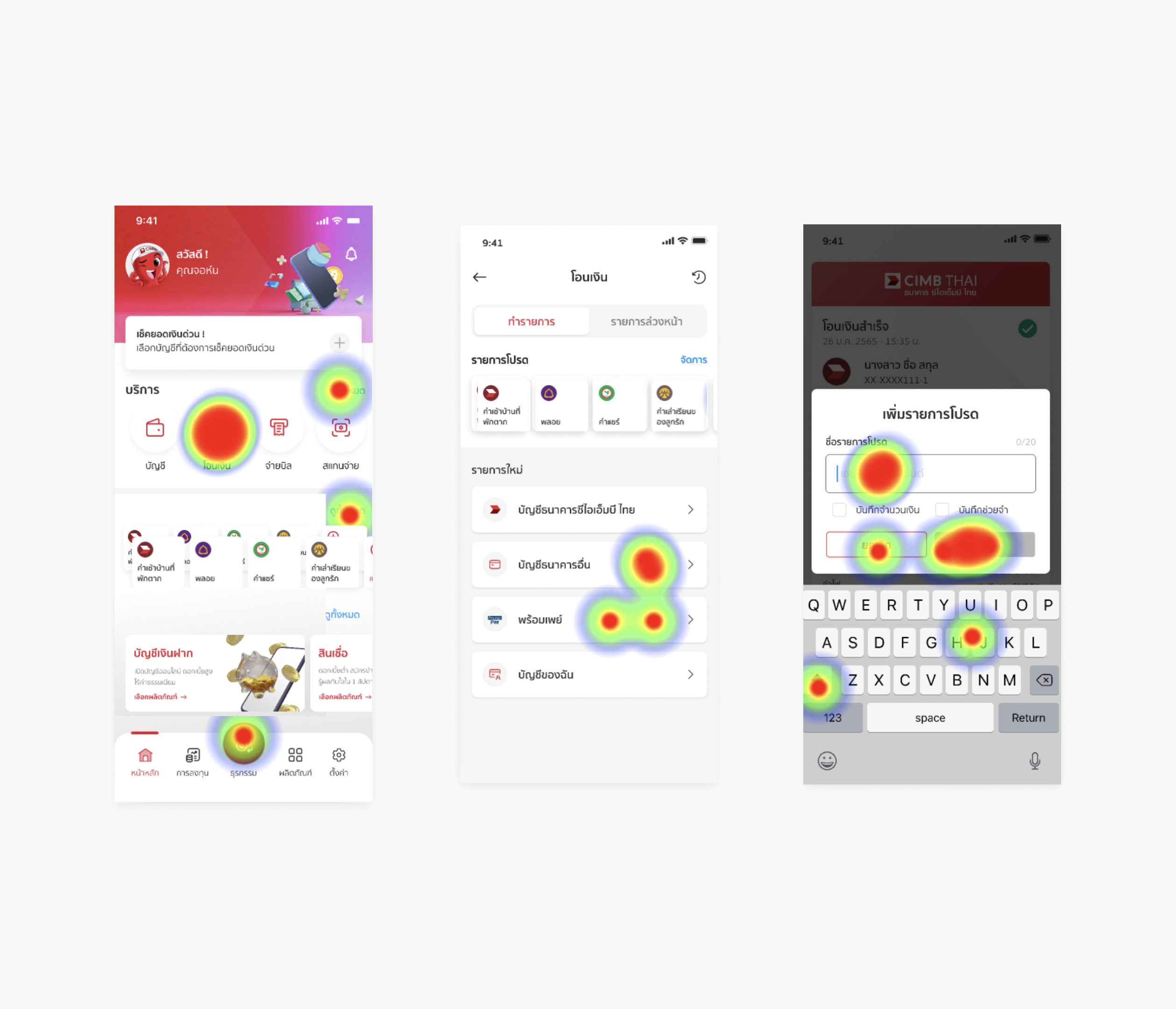
Main Transfer Transaction
• All major features are combined, such as transfers, favorites, history, and schedule
• Clear section for each feature in order to make it more accessible
• Simple UI design allows users to mainly focus on information
• All major features are combined, such as transfers, favorites, history, and schedule
• Clear section for each feature in order to make it more accessible
• Simple UI design allows users to mainly focus on information
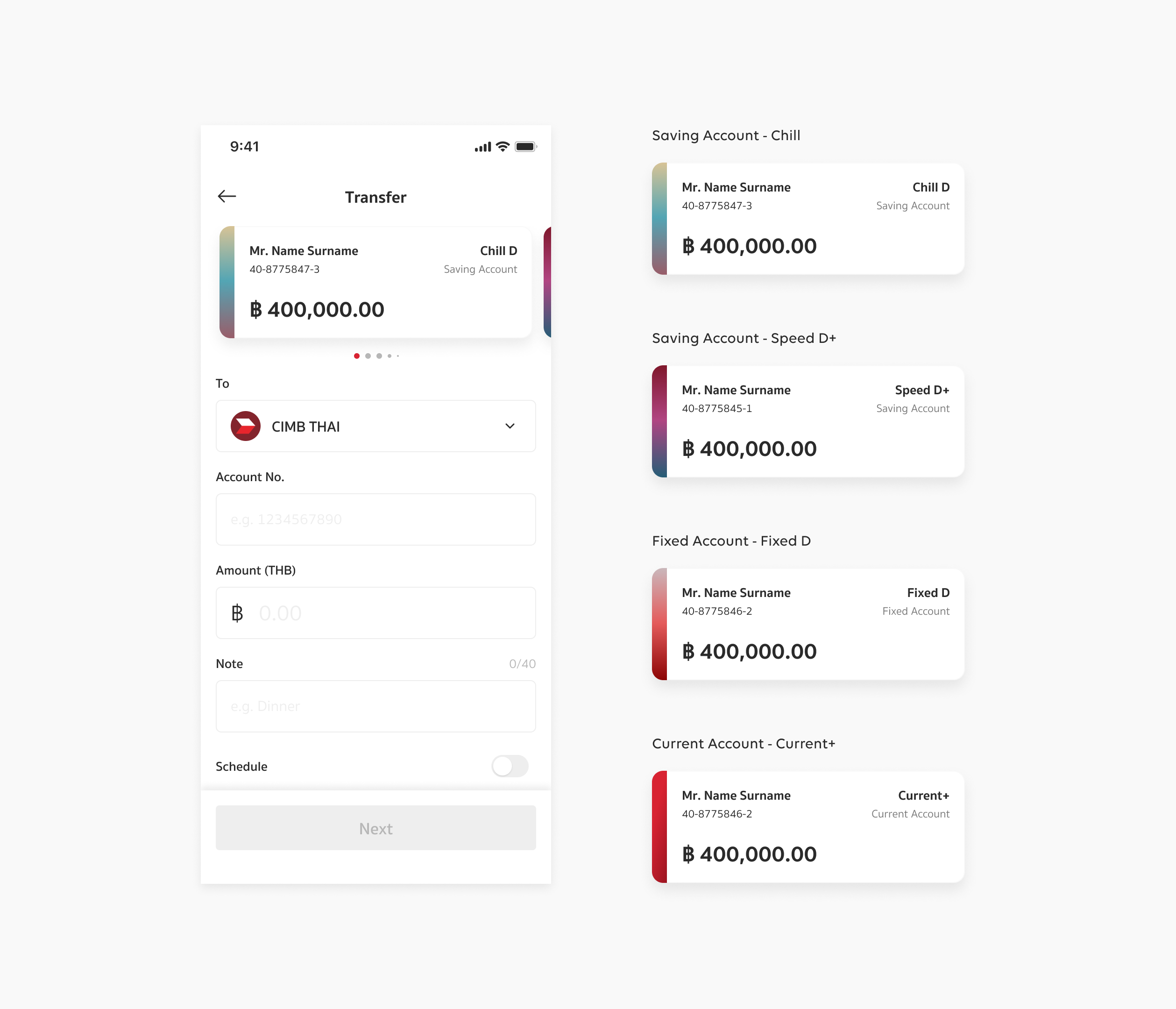
Input Transfer Destination
• Transfer step is concise, with all of the details contained on a single page
• Colors and details help users distinguish between the various types of source funds
• Transfer step is concise, with all of the details contained on a single page
• Colors and details help users distinguish between the various types of source funds
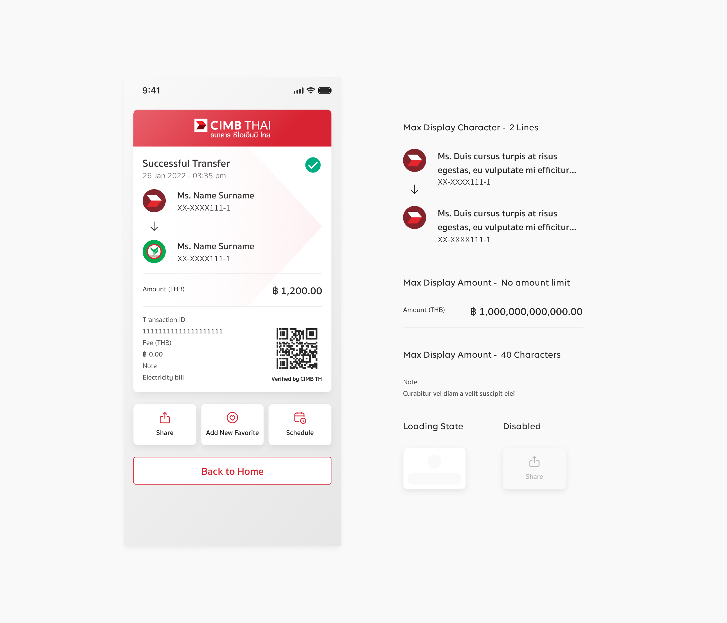
Transaction Slip
• According to user needs, users can immediately share slips, add new favorites, or create new schedules after completing a transaction
• Compact slip, allowing users to see all of the information on a single page
• Include corporate identity throughout the design to increase brand awareness
• According to user needs, users can immediately share slips, add new favorites, or create new schedules after completing a transaction
• Compact slip, allowing users to see all of the information on a single page
• Include corporate identity throughout the design to increase brand awareness
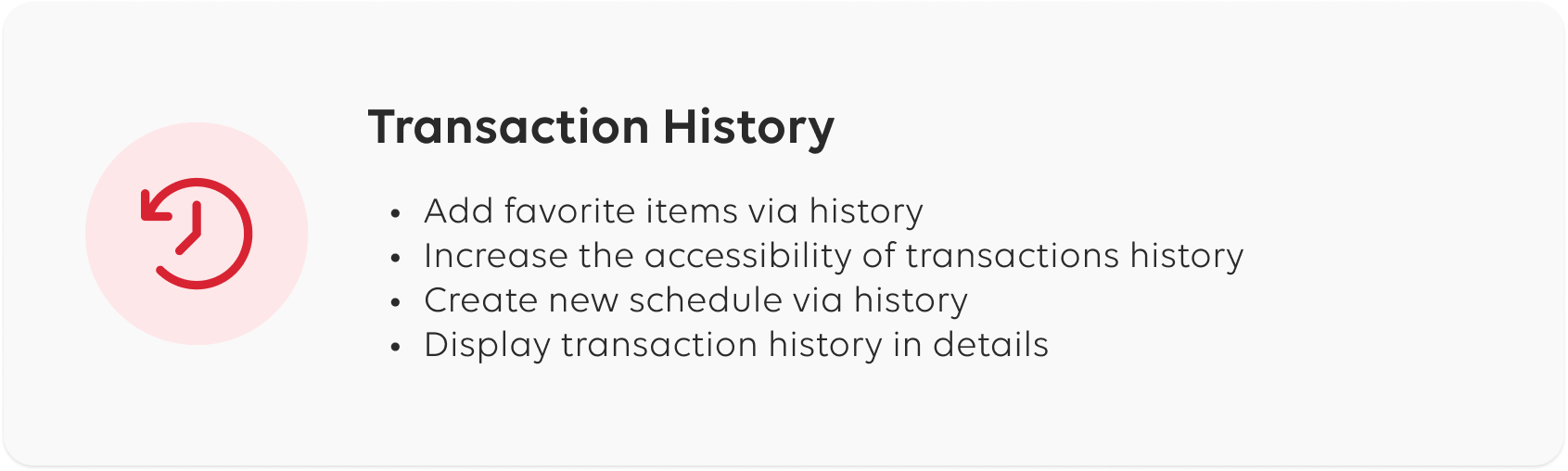
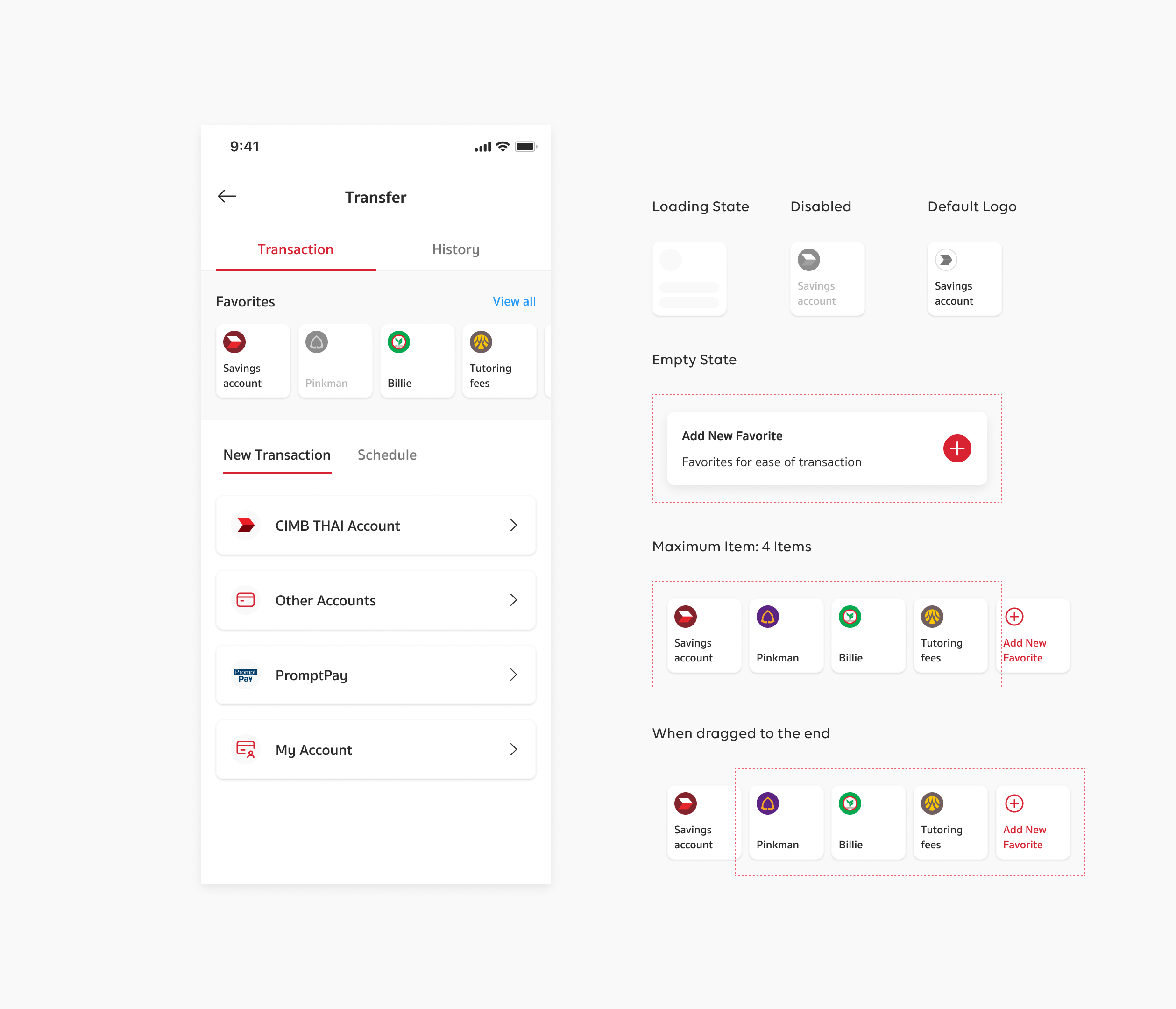
Favorite Management
• Simple and straightforward to add, edit, rearrange, and delete favorite items
• Favorite items are easily accessible
• Simple and straightforward to add, edit, rearrange, and delete favorite items
• Favorite items are easily accessible

Usability Results →
Transfer Transaction
1. All users can complete the tasks without difficulty or confusion
2. The transfer method is simple, easy to understand, and includes steps that users are familiar with from other apps
1. All users can complete the tasks without difficulty or confusion
2. The transfer method is simple, easy to understand, and includes steps that users are familiar with from other apps
Favorites
1. Favorite management can be easily accessed from both the homepage and the transfer main page
2. Users simply use all of the favorite features, such as adding, editing, deleting, and rearranging items
1. Favorite management can be easily accessed from both the homepage and the transfer main page
2. Users simply use all of the favorite features, such as adding, editing, deleting, and rearranging items

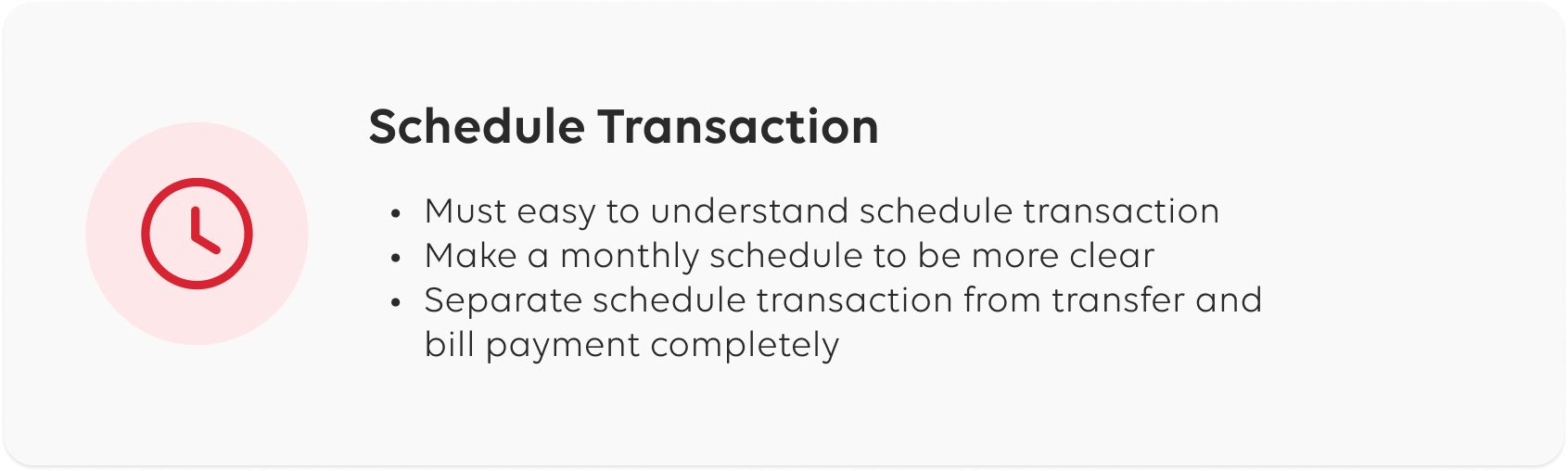
Schedule Transaction
1. Some users assume that they will be able to access scheduled transactions from the main service menu
2. The Thai wording of the monthly schedule is vague, making it difficult for users to understand
3. The monthly schedule's effective date is specified, so users know when the transaction will begin

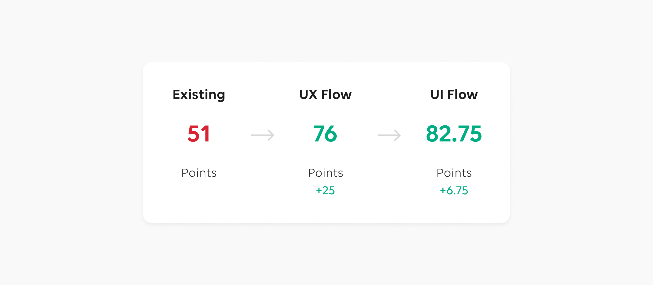
Usability Score
According to the Overall SUS (System Usability Scale), there was a significant improvement in the overall usability of the system. The scores indicate that users found the updated UX and UI flows to be more user-friendly and intuitive compared to the existing design.
The higher score for the UI flow (82.75 points) suggests that the visual elements and interface design enhancements have had a positive impact on user satisfaction, while the high score for the UX flow (76 points) indicates that the underlying structure and organization of the system have been enhanced. The users likely found it easier to accomplish their tasks and access the desired features, resulting in improved efficiency and effectiveness.
Overall, the combined scores demonstrate that the efforts made to improve the design of the system have yielded positive results in terms of usability. These enhancements have positively influenced user perception and satisfaction, ultimately contributing to a better overall user experience.
*These are some parts of the project. Please contact us for further inquiries.