Revamp Design System
Digital Banking App
Digital Banking App
2021 - Present
Discover: Understanding & Empathy →
CIMB Thai is the banking franchise of the CIMB Group, a leading focused ASEAN bank and the 5th largest banking group by assets in ASEAN.
In 2018, CIMB THAI introduced a digital banking app to assist customers by offering consumer banking, commercial banking, investment banking, and asset management products and services.
Based on the reviews and feedback, we discovered that our app has received a lot of negative feedback and the number of users has decreased significantly.
Apps Ranking
Digital banking dominates the top ten rankings in the financial app category, followed by e-wallets. While CIMB Thai Digital Banking is ranked 44th.
![]()
Digital banking dominates the top ten rankings in the financial app category, followed by e-wallets. While CIMB Thai Digital Banking is ranked 44th.

Apps Ratings & Reviews
As you can see, we received a negative response, which was mostly about poor user experiences and unstable app systems.
Not only are the previously mentioned issues, but basic features, such as scanning to pay and favorites, are still not fully supported when compared to other apps. As a result, we must take priority in working to improve transfer transactions, which are major aspects of a banking app.
![]()
As you can see, we received a negative response, which was mostly about poor user experiences and unstable app systems.
Not only are the previously mentioned issues, but basic features, such as scanning to pay and favorites, are still not fully supported when compared to other apps. As a result, we must take priority in working to improve transfer transactions, which are major aspects of a banking app.
Improvement Recommendations
User Experience
• Improve the efficiency of key features (e.g., open account, transfer, bill payment)• Enhance the customization and personalization options available to users
• Strike a balance between usability and business objectives by improving the display of marketing content
• Implement new products and features, including an investment plan, advisor services, and expense tracking
Visual / User Interface
• Revamp the CIMB Design System.
• Ensure the consistency of CIMB's visual and brand identity
• Enhance the consistency of components and elements across the app
• Improve consistency in icons, colors, and typography to facilitate recognition rather than relying on user recall

Define: Problems & Pain Points →
Font Size & Style Issues
We have identified some key issues regarding the font usage in our design. Firstly, the font sizes used for headlines, subtitles, and components are excessively large, which can negatively impact the overall user experience. Additionally, there is inconsistency in the font styles between alphabets and numerals, making it challenging for both designers and developers to create and implement designs effectively.
It is important to address these concerns to ensure a consistent and user-friendly design. By using appropriate font sizes and maintaining consistency across all elements, we can greatly improve the usability and aesthetics of our design.
*Note: The sizes of the components are compared to the screen size (390 x 844 px)
Inconsistent Input Fields
Input fields play a crucial role for users in our app, whether it's entering personal information or inputting transaction amounts. These fields can be categorized into three types: search fields, number fields, and text fields. However, we have identified inconsistencies across all types of text fields, which significantly impact the user experience.
To address this issue, we need to focus on standardizing the design and functionality of input fields. By establishing clear guidelines and implementing consistent styles and behaviors across all types of input fields. This will result in a more intuitive and efficient app, ultimately improving user satisfaction and engagement.
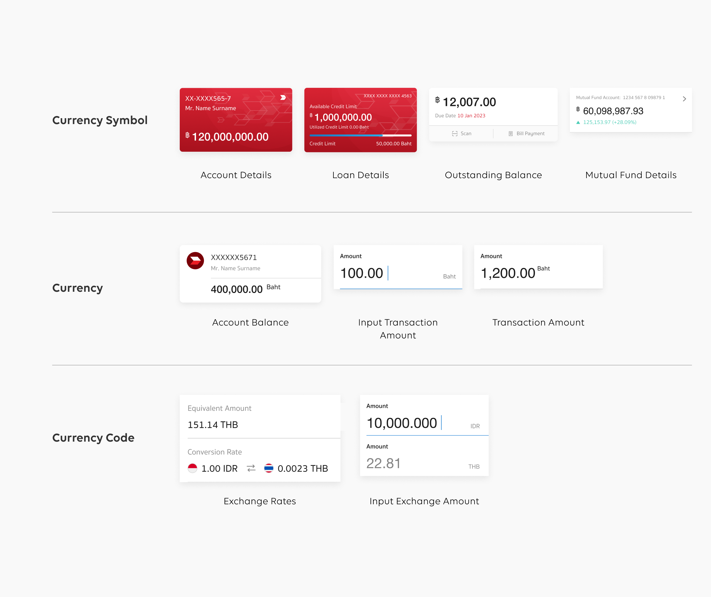
Unaligned Currency Styles
As a financial institution, currency styles are one of the most important parts of our app. Every transaction, information, and detail needs to display the corresponding amount accurately. However, we have identified a significant issue with unaligned currency styles throughout the app, including variations such as ฿, Baht, and THB. This inconsistency has resulted in confusion among our users, as evident from the negative feedback we have received.
To address this problem and provide a seamless user experience, it is imperative that we standardize the currency styles across the entire app. By establishing a consistent and uniform approach to displaying currency, we can eliminate confusion and ensure clarity for our users. This will not only enhance the professionalism and credibility of our app but also contribute to a more cohesive and user-friendly financial experience.
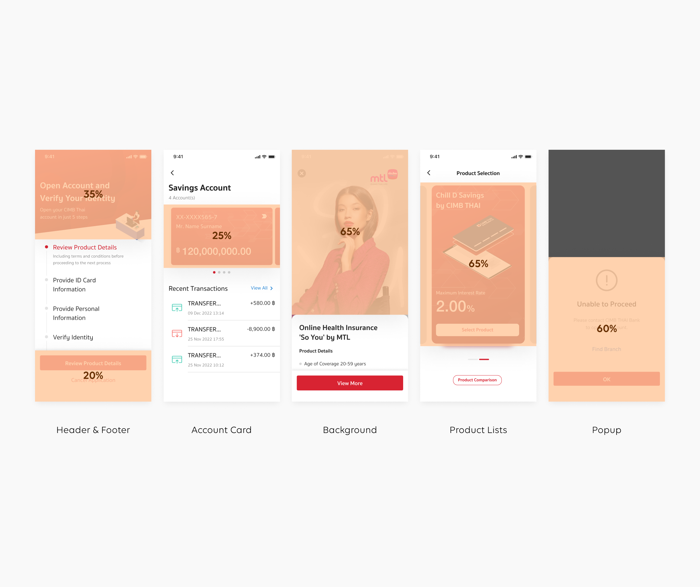
Oversize Components
When it comes to scalability and reusability in the long term, oversized components present significant challenges. As you can see, these components occupy more than 50% of the screen, which can have a detrimental impact on the overall user experience. They make the interface difficult to navigate, overload users with information, and potentially lead to a loss of user engagement.
To effectively address this issue, we need to establish a solid foundation based on a well-structured molecular design approach that follows the principles of Atomic Design. By breaking down our components into smaller, more modular elements, we can ensure flexibility, reusability, and scalability throughout our product ecosystem.
Develop: Iterative, Test & Implement →
FORWARD Design System 2.0
"Forward" is the designated design language system of CIMB TH that enables the creation of modern, simplistic, and engaging experiences for our users through the CIMB TH Digital Banking Application, which is available on both iOS and Android platforms.
The Forward Design Library provides detailed guidelines, reusable UI components, templates, and other resources to assist designers in developing products that align with user-centered philosophy. The library is adaptive and constantly evolving to provide the best possible user experience in any given scenario.
By utilizing this library, designers can enhance the efficiency and consistency of their work across all our products while still maintaining a unique and recognizable CIMB brand identity.
Design Principles

Clarity Consistency
Enable people to see, understand, and act with confidence. Create familiarity and strengthen the intuition by applying the same solution to the same problem.

Naturally Meaningful
Human consciousness and attention resources are limited. Reducing the user's cognitive load, do not distract users, let users focus on task, decision and achievement.

Efficiently Scaling
Help people work better, smarter, and faster. Design with the vision of development and consider the common growth of both users & technology.

Simply Aesthetics
Interface design should fully absorb the laws of nature. A clean, clear goals, immediate feedback and simple style yet reflects brand guidelines makes things feel approachable and efficient.
Revamp Design System Process
![]()
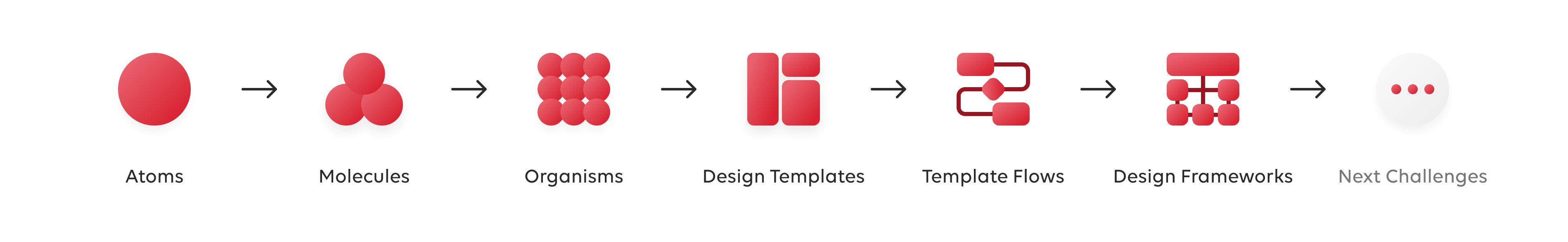
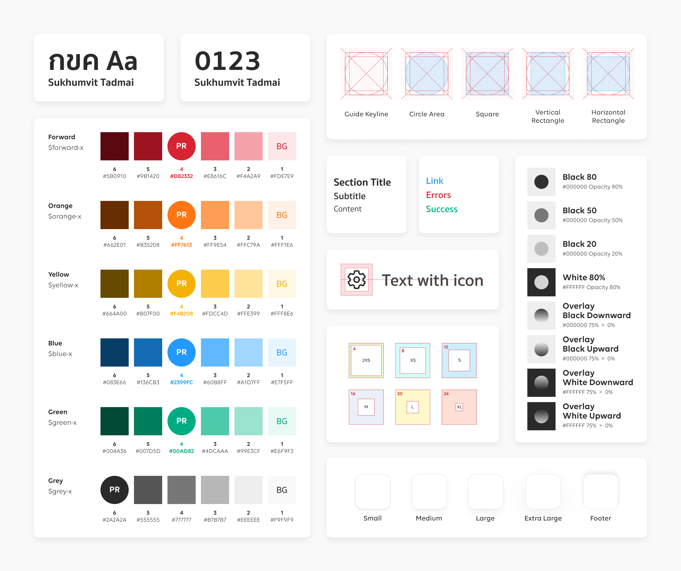
Atoms
Our design process begins with the smallest design elements, called atoms.
We use these atoms to build the foundation blocks of our interfaces, which are adaptable and constantly evolving to provide the best possible user experience in any situation.
• Color Palettes
• Typography
• Iconography
• Grid System & Spacing
• Styles
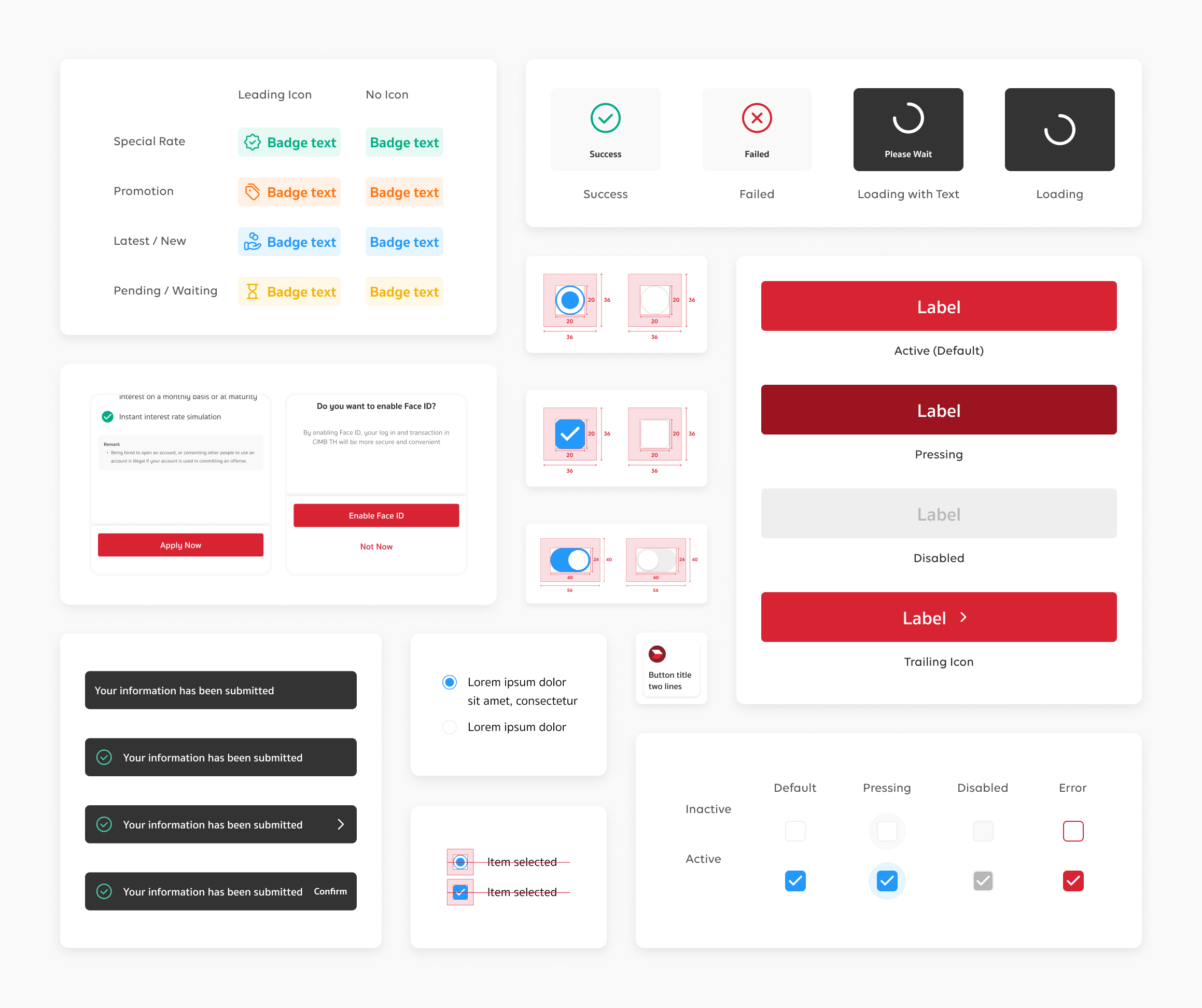
Molecules
As we already have a collection of UI components that consist of atoms, we create a molecule with reusable, modular components that can be combined to create more complex user interfaces.
This helps save time and effort while maintaining consistency and coherence throughout the entire product.
• Buttons
• Text Fields
• Controls
• Message
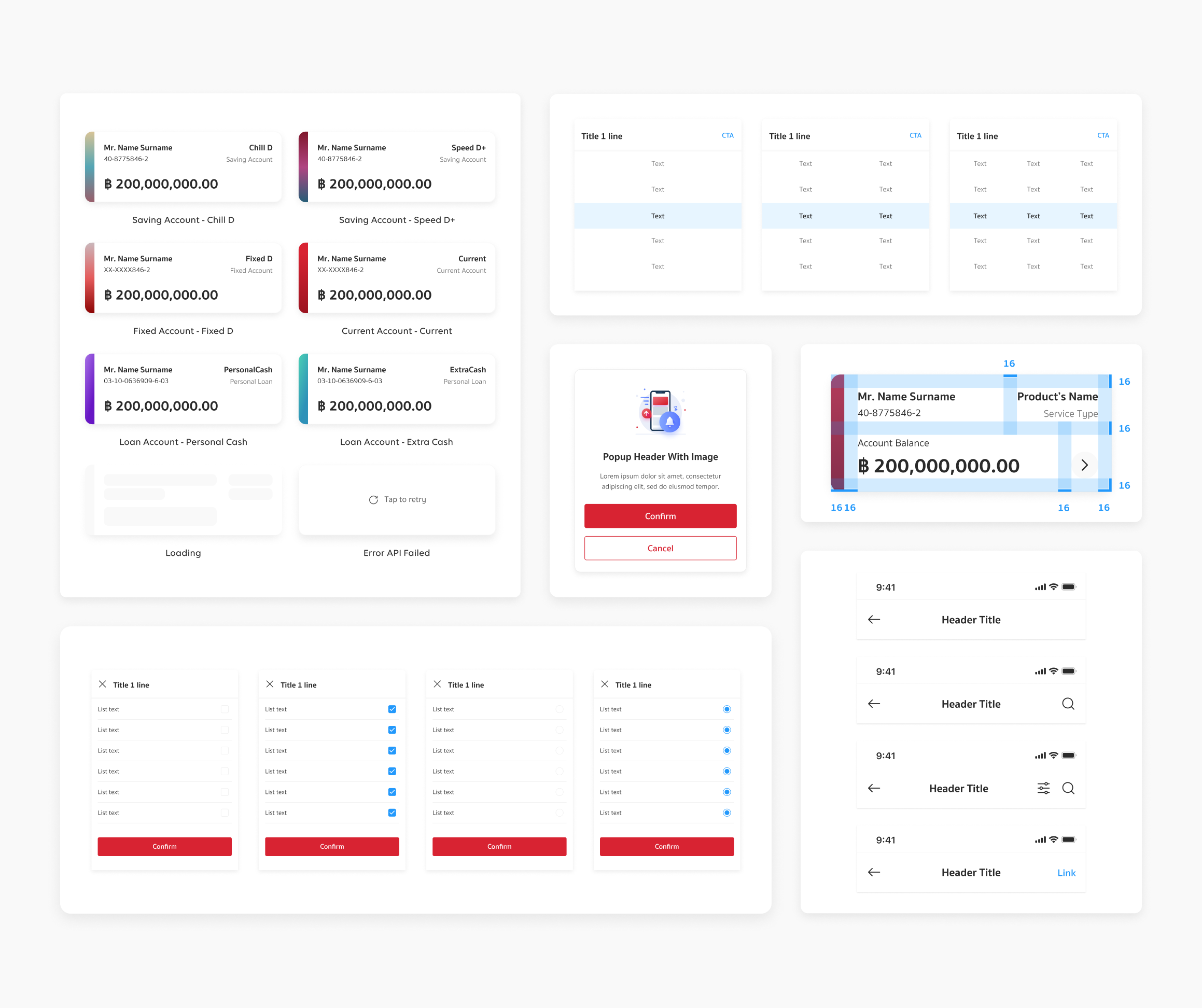
Organisms
Organisms in design systems typically consist of a combination of atomic and molecular components, along with additional styling and layout rules to tie everything together.
Our organisms are designed to be reusable and modular, which makes it easier for designers and developers to create consistent and cohesive user interfaces.
• Headers
• Modals
• Actionsheets
• Cards
• Footer
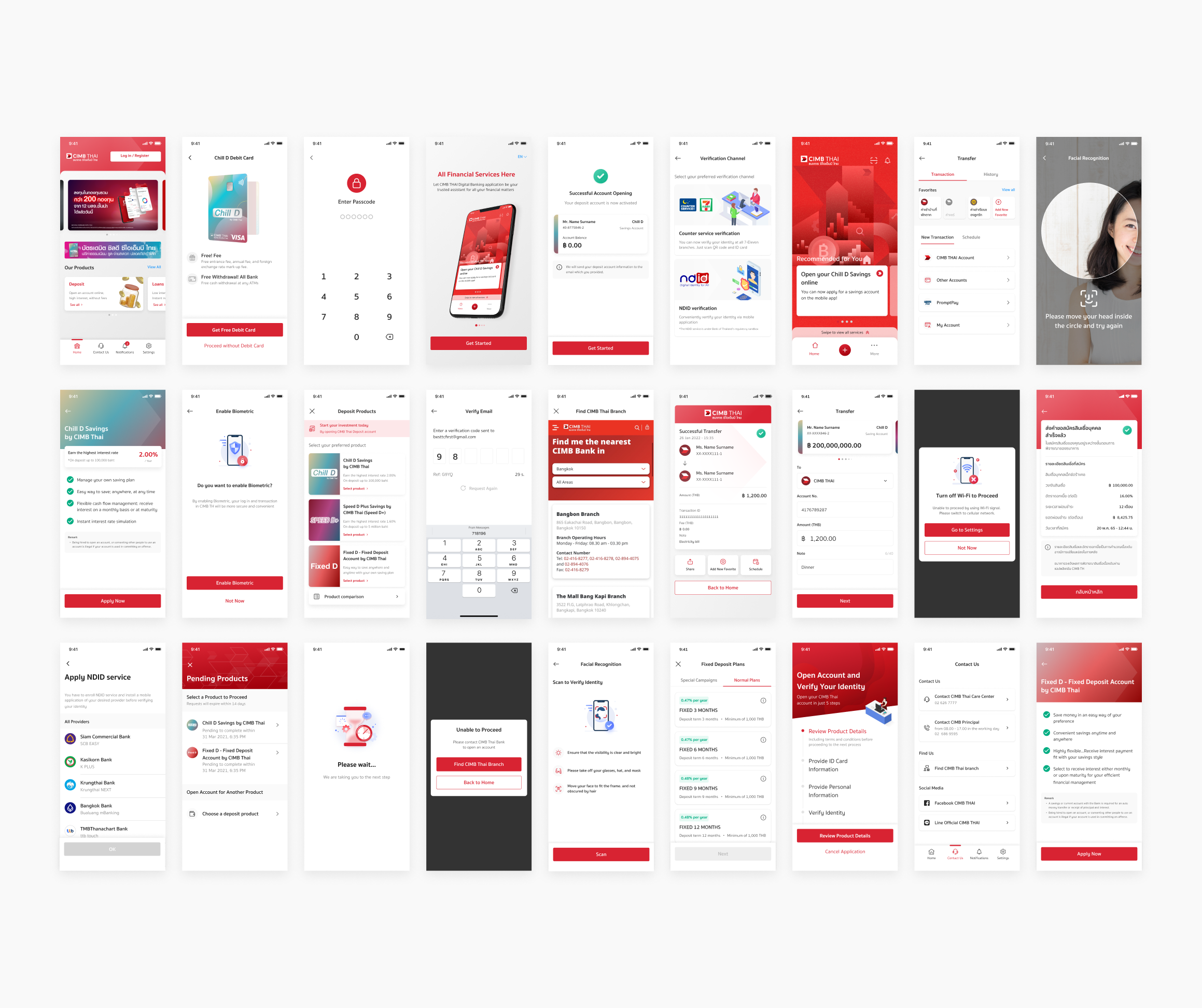
Design Templates
Design templates ensure aesthetic consistency and appeal across all our apps, making it easy to create scalable, customizable, and maintainable designs that fit the unique requirements of each project.
With over 1,000 screens crafted to perfection, our team has also developed optimized variants for seamless use in a single click.
• Reliable Design
• Optimized Variants
• Seamless Section Scouting
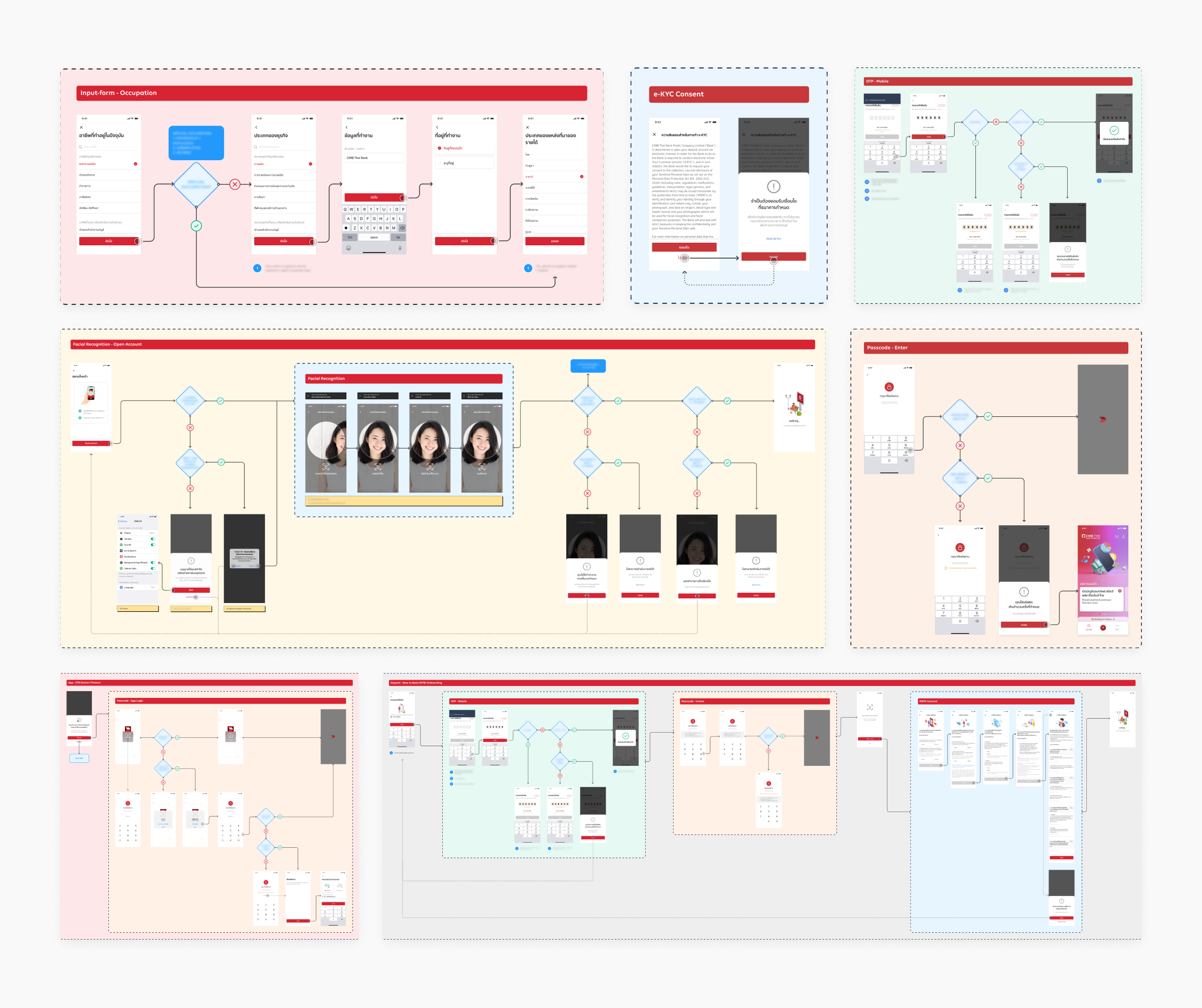
Template Flows
Template flows play a critical role in ensuring that the logic behind our designs is consistent, aligned with both user experience and backend functionality, especially in a sensitive industry like banking where obtaining user consent for sensitive information is crucial.
By implementing template flows, we have achieved clarity and consistency in our designs, which has helped us to improve communication and can now focus on creating designs while ensuring that all sensitive information is handled with the utmost care and security.
• Standardize Flow & Logic
• Smooth & Simple Journey
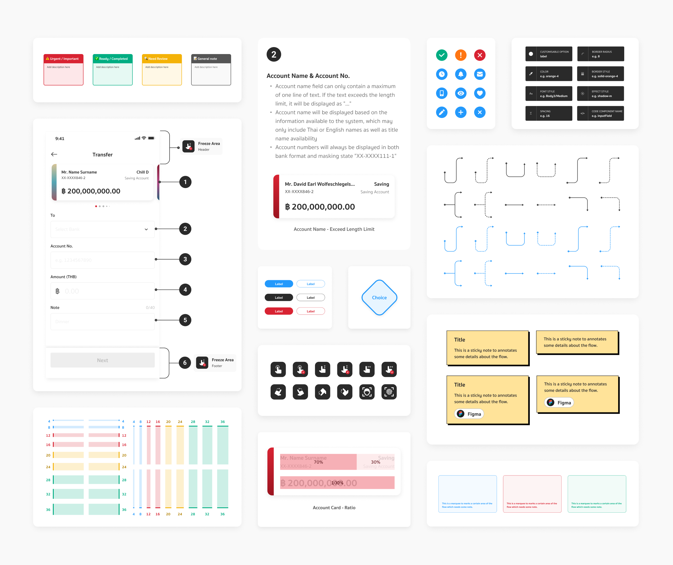
Design Frameworks
Beyond our design templates and template flows, we constantly push ourselves to innovate by introducing innovative design frameworks. These frameworks help designers save time and resources by providing a structured approach to decision-making and problem-solving.
With these frameworks, our team creates designs that are not only visually appealing but also functional and user-friendly.
• Helpers & Deliverable Tools
• Consistency In All Aspects
• Effective Collaboration
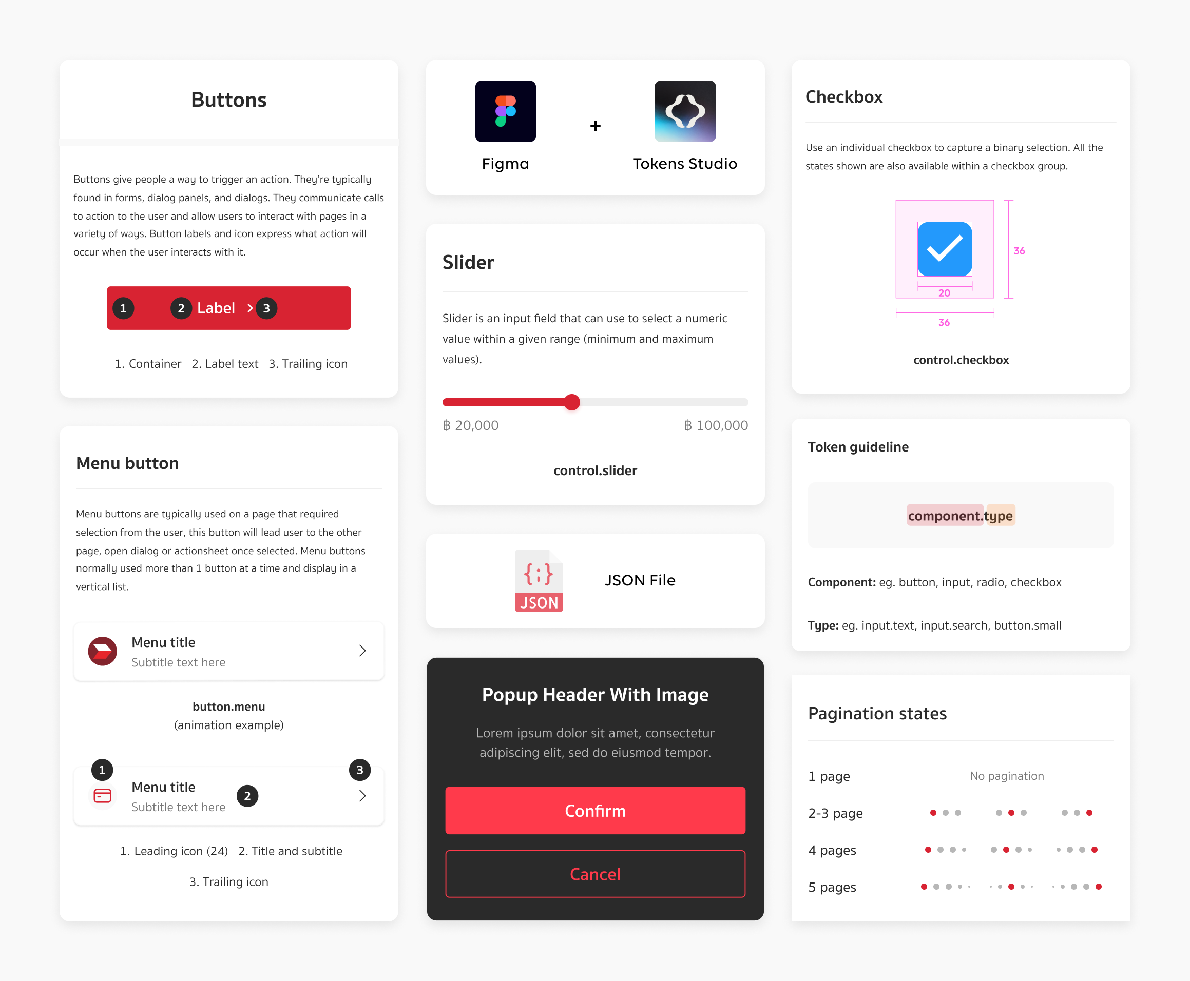
Design Integration
As our design team grows stronger and more structured, challenges remain—such as inconsistencies in design accuracy and a slow development process. To address this, we take the next step: seamlessly integrating design into code for greater efficiency.
To bridge this gap, design tokens come into play. They create a seamless connection between designers and engineers, ensuring consistency, speeding up development, and making collaboration smoother than ever.
• Design Tokens
• Coded Component
• Unlocking Possibilities
*These are some parts of the project. Please contact us for further inquiries.